***NB If you are new to the Canadian Temperature Archive Project I encourage you to visit the “Introduction to the Canadian Temperature Database Archive” post for a quick primer on the structure of the dataset and how I am using it to investigate the climate history of Canada.***
Welcome to the Canada Heat project.
I’ve assembled temperature records for various locations across Canada to highlight the effects of Climate Change as evidenced by these datasets. For this project I am specifically focusing on determining the accuracy of claims often made about unprecedented, extreme or record breaking summertime temperatures and heatwaves. I am breaking this down into regional groups to find regional trends and have grouped locations across Canada into these 7 regions.
Maritimes, St Lawrence River, Southern Ontario, Northern Ontario, Prairies, West Coast and finally The North.
In this first instalment of The Project I’ll start in The Maritimes. I have downloaded data for 5 locations; Roughly from east to west they are Fredericton, Charlottetown, Halifax, Sydney, and St John’s. Each of these locations has a separate post with data for each location readily displayed and can be examined individually and in detail. I encourage you to take a look.
Let’s look at the data and see what’s happening at Sydney NS.

FIGURE 1

FIGURE 2
Figure 1 and 2 show the daily maximum and daily minimum temperatures as recorded, the 30 day running average in pink and the 1 year and 20 average overlaid as annotated.
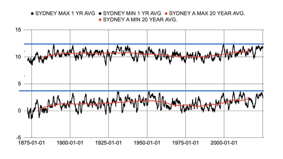
FIGURE 3
Figure 3 shows the 1 year average and the 20 year average for the daily maximum and minimum in more detail. I’ve drawn a line in blue that roughly bounds the maximum dataset range prior to present day and can be considered a natural boundary. Any temperature that is below this temperature can’t automatically be assumed to be the result of human activity since it has happened in the past. For clarity, another way of saying this is that when current temperatures are at or below historical temperatures we can’t, without other evidence, claim these temperatures are abnormal or extreme or unprecedented and causing environmental, social or economic disruption and that they are due to human activity. As an example we can’t say that forest fires are worse due to human caused climate change when the climate conditions are not outside the natural bound and have been seen before in the actual temperature data record.

FIGURE 4
Figure 4 shows the annual number of days that temperatures exceeded 26 degrees. The number of days experiencing temperatures above 26 degrees increases to a maximum at about 1950 and 2024, but overall there is no upward trend.
We often hear that while the average temperature may not be increasing, the number of days that exceed an arbitrary maximum will have an impact on human health and the environment is increasing, and that this is due to Climate Change increasing the number of these “heat waves”. For the Maritimes this is difficult to justify since there are very few days that the temperature actually gets to levels that could be considered a danger to human health or the environment. As we move west in other regions this becomes a more relevant issue but for the sake of argument let’s use 26 degrees as a cutoff.

FIGURE 5
Figure 5 shows the daily average temperature above 26 degrees for the Sydney dataset. The hottest days are seen in the 1930s. There is no increasing trend for maximum temperatures.
Maybe the warming is more obvious in the spring or fall.

FIGURE 6
It is sometimes suggested that, there are more days above 26 degrees in the spring or fall. Figure 6 shows the number of days in Spring and Fall above 26 degrees, again there is no trend to higher temperatures in the shoulder seasons.
Check out how this location compares to the Maritime region in the Maritime Heat post.