***NB If you are new to the Canadian Temperature Archive Project I encourage you to visit the “Introduction to the Canadian Temperature Database Archive” post for a quick primer on the structure of the dataset and how I am using it to investigate the climate history of Canada.***
Welcome to the Canada Heat project.
I’ve assembled temperature records for various locations across Canada to highlight the effects of Climate Change as evidenced by these datasets. For this project I am specifically focusing on determining the accuracy of claims often made about unprecedented, extreme or record breaking summertime temperatures and heatwaves. I am breaking this down into regional groups to find regional trends and have grouped locations across Canada into these 7 regions.
Maritimes, St Lawrence River, Southern Ontario, Northern Ontario, Prairies, West Coast and finally The North.
In this first instalment of The Project I’ll start in The Maritimes. I have downloaded data for 5 locations; Roughly from east to west they are Fredericton, Charlottetown, Halifax, Sydney, and St John’s. Each of these locations has a separate post. The data for each location can be examined individually and in detail and I encourage you to take a look.
In this post I have created a Maritime Aggregate average temperature dataset from the five data locations.
Let’s look at the data and see what’s happening in the Maritimes.
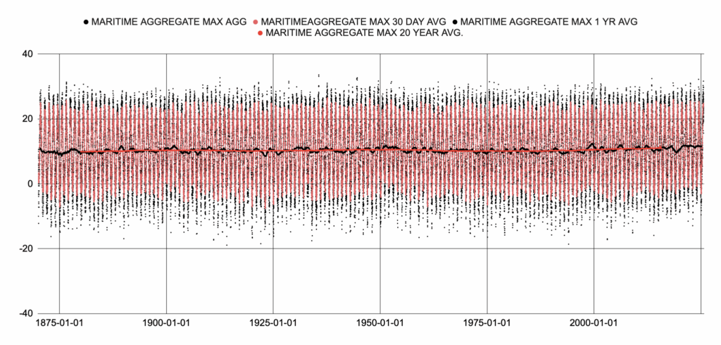
Figure 1

Figure 2
Figure 1 and 2 show the result of a simple average of the five locations.
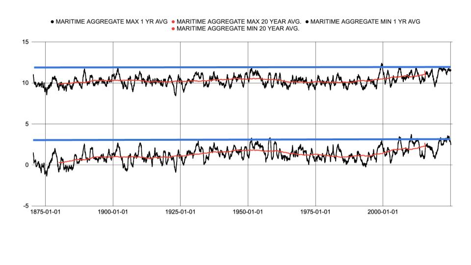
Figure 3
Figure 3 shows the 1 year average and the 20 year average for the daily maximum and minimum. I’ve drawn a line in blue that roughly bounds the maximum dataset range prior to present day and can be considered a natural boundary. Any temperature that is below this temperature can’t automatically be assumed to be the result of human activity since it has happened in the past. Kinda goes without saying. For clarity, another way of saying this is that when current temperatures are at or below historical temperatures we can’t without other evidence claim these temperatures are abnormal or extreme or unprecedented and causing environmental, social or economic disruption due to human activity. As an example we can’t say that forest fires are worse due to human caused climate change when the climate conditions are not outside the natural bound and have been seen before in the actual temperature data record. Right????
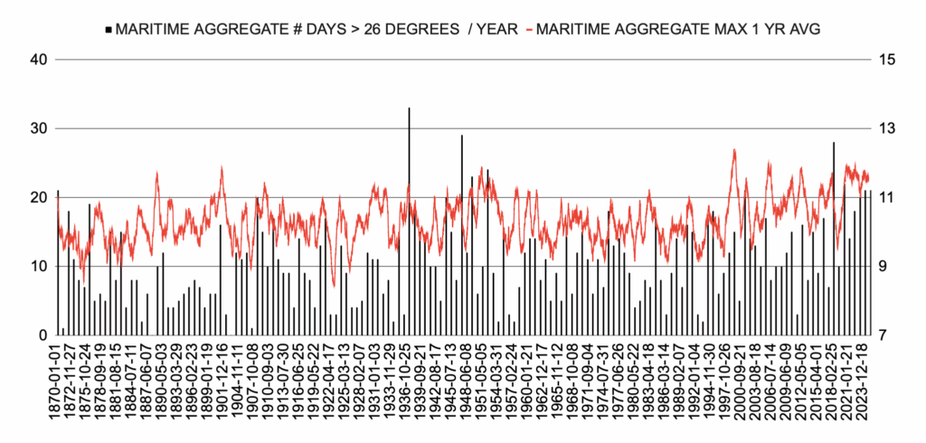
Figure 4 shows the annual number of days that temperatures exceeded 26 degrees. Even using 26 degrees, a pretty comfortable temperature as the cutoff temperature few years experience more than 10 days of what I would call decent summer weather.
There may be some other ways Climate Change impact the environment. We often hear that while the average temperature range may not increasing, the number of days that exceed an arbitrary maximum will have an impact on human health and the environment, and that Climate Change is increasing the number of these “heat waves”. For the Maritimes this is difficult to justify since there are very few days that the temperature actually gets to levels that could be considered a danger to human health or the environment. As we move west in other regions this becomes a more relevant issue but for the sake of argument lets use a fairly low hurdle of 26 degrees as a cutoff and see if there is a trend in the number of days at or over 26 degrees.
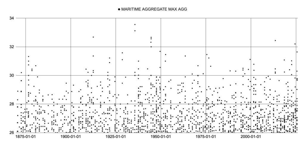
Figure 5 shows the daily average temperature for the Maritime dataset. There are only 2 days since 1950 that exceed 32 degrees. The hottest days are seen in the 1930s. There is no increasing trend for maximum temperatures in the Maritimes.
Datapoints for daily maximum temperature using a cutoff of 26 the 1920s to 1930s are home to the highest regional temperatures and there does not appear to be any trend to more hotter days.
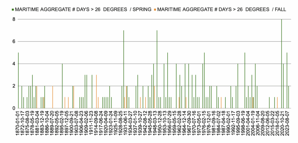
Figure 6
Well, they say, maybe there are more days above 26 degrees in the spring or fall. Figure 6 shows the number of days in fall and spring above 26 degrees and does not show a trend to higher temperatures in the shoulder seasons.
As we progress with this journey through the Canadian dataset it will be useful to determine how these results compare to other areas globally. I’ve selected 3 datasets to compare with our analysis.
The UAH satellite temperature record is, in my opinion the only logical way to settle the global temperature debate but it only goes back to 1979 for obvious reasons. I’ll use their Northern Hemisphere Extratropical average temperature as a comparison for recent data but before 1979 we need to accept there is no possible way to “create” data when it was never recorded.
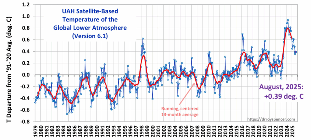
Figure 7 is a copy of the UAH Satellite database from the UAH website maintained By Dr. Spencer. This is the global average and is how the data is usually presented and referenced. Notice the total temperature range is 2 degrees.
Next I will use a summary of recorded temperatures for 433 worldwide locations.
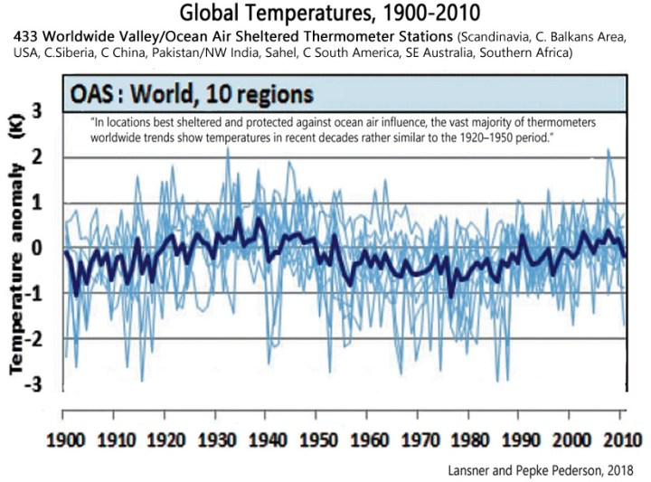
Figure 8 is from a paper published in 2018. The authors have created an average temperature profile from 433 global temperature records that we can compare to the temperature profiles from the Canadian archive data. Notice that like the satellite data the data is presented as an anomaly relative to a datum so we can only compare relative trends and not absolute temperatures.
We also have a wide array of Global Climate Models that predict possible outcomes for various emission scenarios.
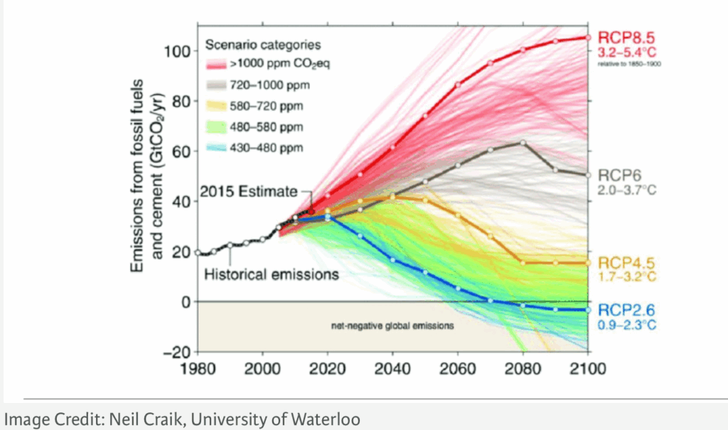
Figure 9 shows the rationale used by various researchers to populate the CO2 levels in their models. If this interests you, you can find lots of commentary on the internet regarding these scenarios.
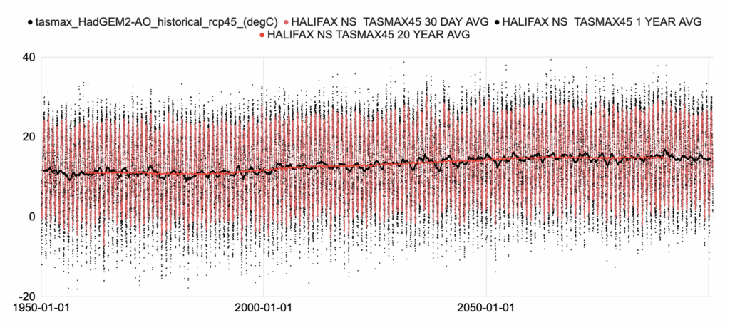
Figure 10 shows the Hadley climate research institute model run for the RCP4.5 emission scenario at Halifax Nova Scotia.
Comparison of Canadian Archived data with Satellite data, other Worldwide Thermometer data and thirdly, Computer Model data.
First let’s compare the Canadian archive data with the UAH global average lower tropospheric temperature (LT) anomaly measured as the departure from the 1991-2020 mean data.
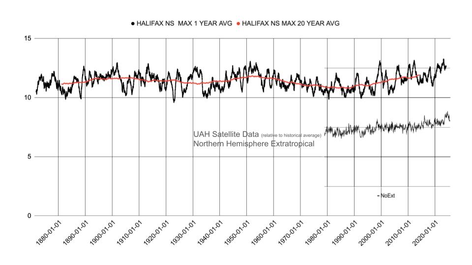
Figure 11 shows a comparison of the 1 year average daily maximum and 20 year average from the Canadian database for Halifax and the Satellite data from 1979. The satellite data is referenced to a baseline period. It is a relative temperature so we can compare the resulting trends but not absolute temperatures. The UAH data and the 20 year average from the Canadian Archive data have similar trends; cool trend from 1979 – 1998 then rising until the present. So a reasonably good agreement.
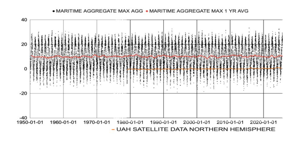
Figure 12 shows the anomaly for UAH satellite data 1979 – present displayed with the archive data for reference.
There is a reason advocates of “Climate Change” tend to use averages and anomalies relative to a reference period. As figure 12 shows the anomaly, shown by the UAH data, is very small relative to the range of temperatures at an location, in this case the temperature data spans 50 degrees annually and the anomaly is about 0.5 – 1 degree or 1 – 2%. In fact it seems like a pretty stable system from 1979 – present. Anomalies like the warmth in 2024 likely are not uncommon. It is very likely the satellite data during this brief period is neither unprecedented nor historically unique. We can never know what the satellite data would have been in the 1920s – 1950s but it is reasonable to suggest the data would show anomalies equal to or greater than today’s satellite data. Certainly we can not say that there were never periods of greater global average temperatures. In spite of this shortcoming the database is really important as it will benchmark the rhetoric in the future and we will be able to confidently understand the state of the global temperature using this data as long as we understand how it relates to actual thermometer data.
Next Let’s compare the 433 location global average temperature.
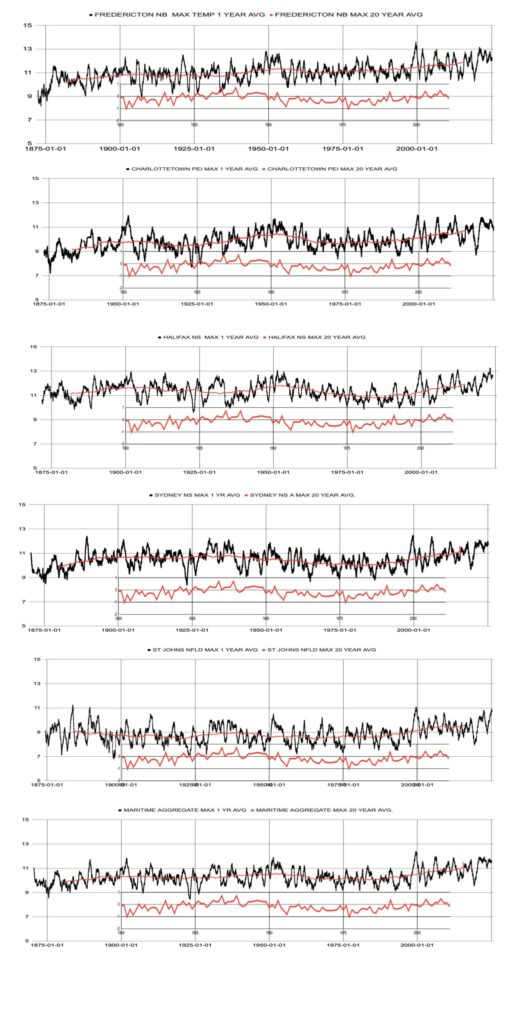
Figure 13 shows each individual location and the Maritime average compared with the 433 Location global thermometer average overlaid in red.
In the Introduction to the Canadian Temperature Database Archive post it was shown that the archived database consistently showed a warm period in the second quarter of the 1900’s followed by a cooler period until the last quarter of the century and warming returning until the present. This also is the case for the Maritime data and closely compares to the data from the published 433 Location global thermometer average.
Finally let’s look at the model data and compare to Canadian archived data.
All of the figures show only the interval where the model and the actual temperature data overlap.

Figure 14 TASMAX 8.5. This is the model output created using the highest emission scenario, RCP 8.5, by the Hadley Centre. The interval shown is where the data and model overlap.

Figure 15 TASMAX 4.5. This is the model output for the model created using the most likely emission scenario, RCP 4.5, by the Hadley Centre. The interval shown is where the data and model overlap

Figure 16 TASMAX 2.6. This is the model output for the model created using the low emissions scenario, RCP 2.6, by the Hadley Centre. The interval shown is where the data and model overlap
The three models created in 2008 show the same outcome for 1950 – 2006, because the hind-casting used by all the scenarios is from the actual measured CO2 levels prior to 2006. As a result all three perform equally poorly at capturing the cooling trend from 1950 – 1980 seen in the temperature database.
The interval from 2006 -2015 also show a divergent result for the RCP 8.5 and 4.5 compared to the 20 year average from the Canadian archive data with the model data showing a higher amount of warming. The RCP 2.6 model does a pretty good job of capturing the recent trend. In other words the models that use an increasing amount of heat from CO2 concentrations perform poorly while the model using falling emissions of CO2 gives the best fit. CLIMATE CHANGE!!!! WHAT CLIMATE CHANGE???
Discussion
We’ve shown that in the Maritimes the data as archived in the Canadian temperature record show no detectable impact from CO2 emissions beyond the natural range. The temperatures in the 1920 – 1950 roughly are as high as today’s temperatures. There is no way to scientifically attribute current temperatures to “Climate Change” when they are the expected outcome from natural climate.
There is no increasing trend in daily maximum summer temperatures overall or during the shoulder seasons as often claimed. In fact there are temperature records for several locations in the Maritimes in the 1920 -1950 period that exceed the highest temperatures in the recent. It is a fallacy that summer temperatures are increasing with no apperance of the often mythically claimed 40 degree temperatures.
We’ve also shown the data from the Canadian database compare favourably with the temperature trends from global temperature records around the world. The trends we are seeing are supported by other investigators around the world and we can confidently proceed with our project.
Further the data show that the motivation for investigators to use 1950 as a cutoff for modelling is likely due to the inability of the models to recreate the historical temperature trend using only the natural variables in the model scenarios prior to 2006. This is not due to the lack of data prior to 1950 as claimed by the investigators, it is due to the short comings of the models to predict the warmer temperatures prior to 1950. Even worse for “The Science” the models actually suggest the recent temperatures are more accurately modelled by the RCP 2.6 scenario which is the reducing CO2 emissions scenario.
Conclusions
Climate change advocates in the past have limited their rhetoric to predictions of future emergencies. This has worked very well for them as it was easy to create mind boggling models that can be nudged and prodded to show whatever outcome you desire. Lately however, they have strayed from this safe debating tactic of always pushing the emergency into the future. The safe argument relying on future effects has been abandoned. It is now replaced by the claim that present day weather events are being caused by “THE CLIMATE CHANGE”. This is a fatal debating decision when you have no evidence to support the claim. The alarmist argument is, so far, not supported by current data. We’ll keep looking maybe it’s out there. You never know
This is just the start we’ll see if this trend continues as we move westward.
Look for the next instalment of The Canadian Temperature Data Project: “St. Lawrence Valley Heat”