Introduction
In this installment of From The Desk Of Shifty I will evaluate the merits of alarmist references to “Climate Change” in Canada using the temperature data archived in the Environment Canada database. Around the world incredible amounts of money are spent by government departments, NGOs, universities, etc. to support the narrative of Catastrophic Anthropogenic Climate Change. The output of this massive effort to support this narrative most often are presented as models or predictions of future climate. These models, almost exclusively present the state of the climate as some version of a “Global Mean Temperature” relative to a reference period baseline and expressed as degrees departure from the baseline over a period of time. I think over a trillion dollars has been spent to create simplistic graphs in uncountable versions and scenarios.
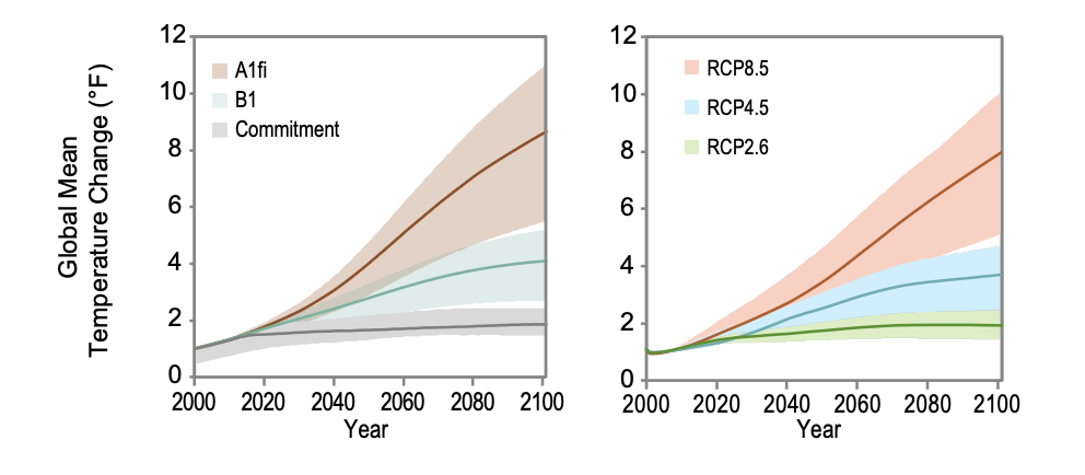
There are endless examples of output from these types of enquiries, they all have one thing in common, all these types of analysis make it difficult to relate the output of the analysis to our everyday experience simply because they are always referenced as a mean temperature.
Humans don’t live in a statistical world. No one ever asks “what will the mean temperature be today.” We live in a world of “what the temperature is now, what the high temperature will be today and what the low temperature will be tonight”. Not surprisingly this is exactly how the data has been recorded, daily maximum temperature (Tmax) and daily minimum temperature (Tmin). That’s it. Recently, modern technology has allowed records to be more detailed, including hourly data or satellite data etc, but the recorded data for most of the historical database is daily Tmax and Tmin.
Few examples of comparisons to actual data exist in the public discourse. Humans experience temperature and to a logical extension, climate, as a function of daily max/min temperature yet few have seen how this actual experience relates to the broader discussion of Climate Change. Media reports often reference climate change as the cause of the disaster of the day, or being responsible for a record high temperature with very little or no context.
What Does The Official Database Look Like?
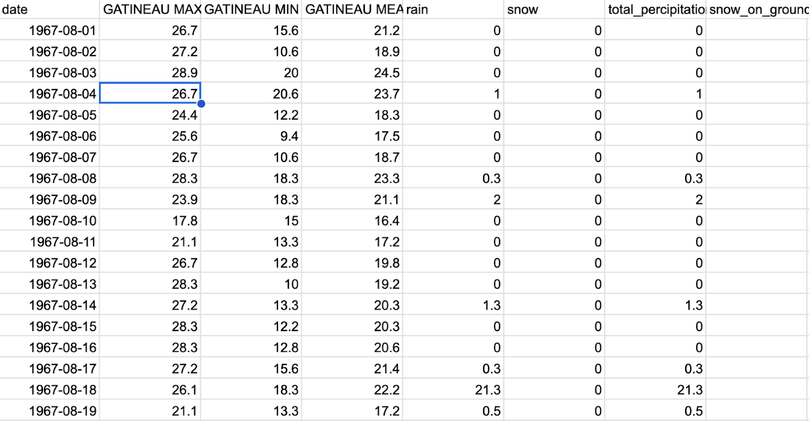
When I first started looking at these raw database examples I was amazed. The amount of temperature data is massive. For example, I have found myself working with spreadsheets that contain 1 million cells. The data is extremely basic, the temperature, and simple, usually just 3 significant figures, but it is amazing to know the temperature of a place in Canada in the late 1800’s.
Here’s what the data looks like:
This is a small piece of a typical record as archived in the government database. The example shown is for a couple of weeks.
We can plot each day’s entry and start to visualize the temperature history for an area.
(NOTE; all graphs are temperature in degree celsius on the vertical axis and date on the horizontal axis)

Each dot represents the value for the high or maximum temperature during that day. I’ve plotted it in four time intervals each year, roughly into seasons winter, spring, summer, fall.
The graph below displays the low or minimum temperature of the day.


Visual inspection of the temperature data at these locations indicates that on any given day the maximum and minimum temperature can each vary by over 10 degrees.
Here is a more detailed look at the data for just two years.

At this point it is important to keep in mind that the total global anomaly in the government created model scenarios over more than a century is about 1-2 C. The anomaly is about 1/5th of the expected daily range in temperature. Even the most outlandish and widely discredited RCP8.5 scenario with very scary temperature increases of 6-7 degrees is still less than the range expected on any given day. In other words the signal is noisier than the anomaly.
Fortunately there are some locations that have such a standing in history that there are complete records going back over 100 years, for instance the Sydney Nova Scotia dataset goes back to 1870. We can use these records to compare the reality of the last one and a half centuries with the created “imagined” reality of government scientific assessments and, more specifically the outsized claims made by rent seekers in government and the media..
Here’s the data for Sydney, Nova Scotia.


At this point you must be a bit surprised. Where is that rapidly rising temperature graph that we always see in the government assessments and media’s sensationalized reporting?
There are, however, some things that are apparent to the naked eye.
The upper bound of both datasets is fairly constant.
The lower bound of both graphs is somewhat more variable, and the min temp graph shows the most variability.
This is the case for the large majority of locations in the datasets in Canada.
Lets try a simple running average to attempt to visualize any trends in the data.
Here’s a 1 year running average.

Here is the 1 year running average in more detail with the 20 year average superimposed.

The addition of a 20 year running average is a useful tool to highlight any long term trends.
Let’s look at a few more.
Here is the record holder for the longest record in the Canadian thermometer temperature dataset.
Toronto.

Further west.
Winnipeg:

Banff National Park:

West Coast:
NANAIMO BRITISH COLUMBIA

SHAWNIGAN LAKE BRITISH COLUMBIA

After looking at these sites from across the country several observations can be made. Let’s look at these examples in more detail.
OBSERVATIONS
SYDNEY NOVA SCOTIA

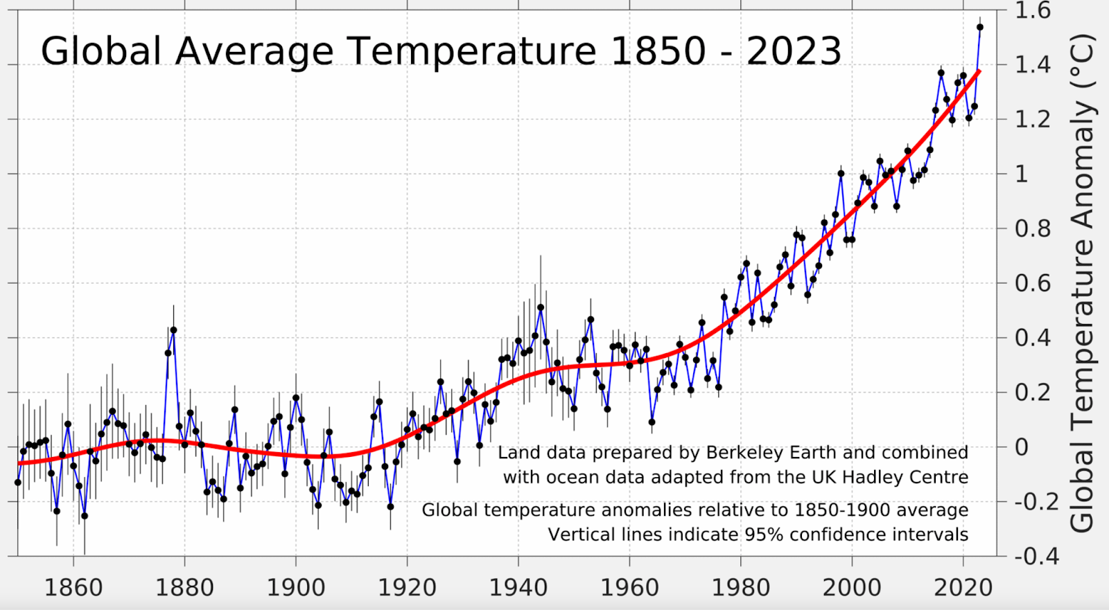
Let’s compare this to the “very scary” Berkeley Earth data.
Above is the Berkeley Earth Interpreted Global Average scaled to approximately match the thermometer data.
Berkeley Earth Interpretation as shown on the website.
Thermometer data from Sydney shows a much different record. The actual temperature fluctuates with an amplitude of 3-4 degrees celsius and repeats with a period of about 40 years. This, to me, is exactly what we would expect a naturally varying climate system would look like and is also very well supported by real world data including historical references and personal experience.
Summary:
The Sydney temperature data starts in 1873 and until about 1900 the temperature is recovering from a cooler past climate. The temperature remained “warm” until about 1945. This is mostly in agreement with the Berkeley Earth interpretation, The timing is not exact but the trend is similar; both examples are colder before 1900 with a shoulder peak around 1945. After this the different datasets yield fundamental differences. The thermometer record shows a low temperature trend in both Tmax and Tmin around 1985 with an amplitude of about 1C. This Tmin trough is followed by a similar peak value around present day of about 1C above the local minimum. This is a fundamental difference with the Berkeley data; over the same time interval ,1945-present, the Berkeley data is warming over the entire interval.
In “Climate Science” perspective is everything!!!
Urban Heat Island Example
TORONTO ONTARIO
The Toronto thermometer record starts in 1840 in Yorkville and is home to the only thermometer record starting before the late 1800’s. This gives us an opportunity to see a little further into the past and confirm that the cooler temperatures that lasted until 1900 were persistent over a climatic time frame.
The magnitude and persistence of the prolonged and significant cold period since at least 1840 is clearly shown. This is a significant and persistent trend in the Canadian database at large as we will see later. The data show an abrupt increase in both nighttime low (Tmin) and daytime high (Tmax) of about 3 degrees over a span of about 20 years from about 1880 – 1900. These warmer temperatures remain until present day. This looks like a climactic shift if ever there was one.
The data also show a significantly greater increase in the nighttime low temperature (Tmin), compared to the daytime high temperature (Tmax). Could this trend be the “Global Warming” we’re looking for?
Let’s dive in a bit.
The rise, or slope of the Tmin graph bears many similarities to the more familiar Average Global Mean Temperature. Tmin rises fairly steadily starting around 1900 thorough to the end of the record. The slope of Tmax however does not share any of these characteristics. Tmax is dominated by the rise in temperature around 1900 with a peak around 1945, same as the earlier example, Sydney, followed by a cool period around the 1970’s and rising again until present.
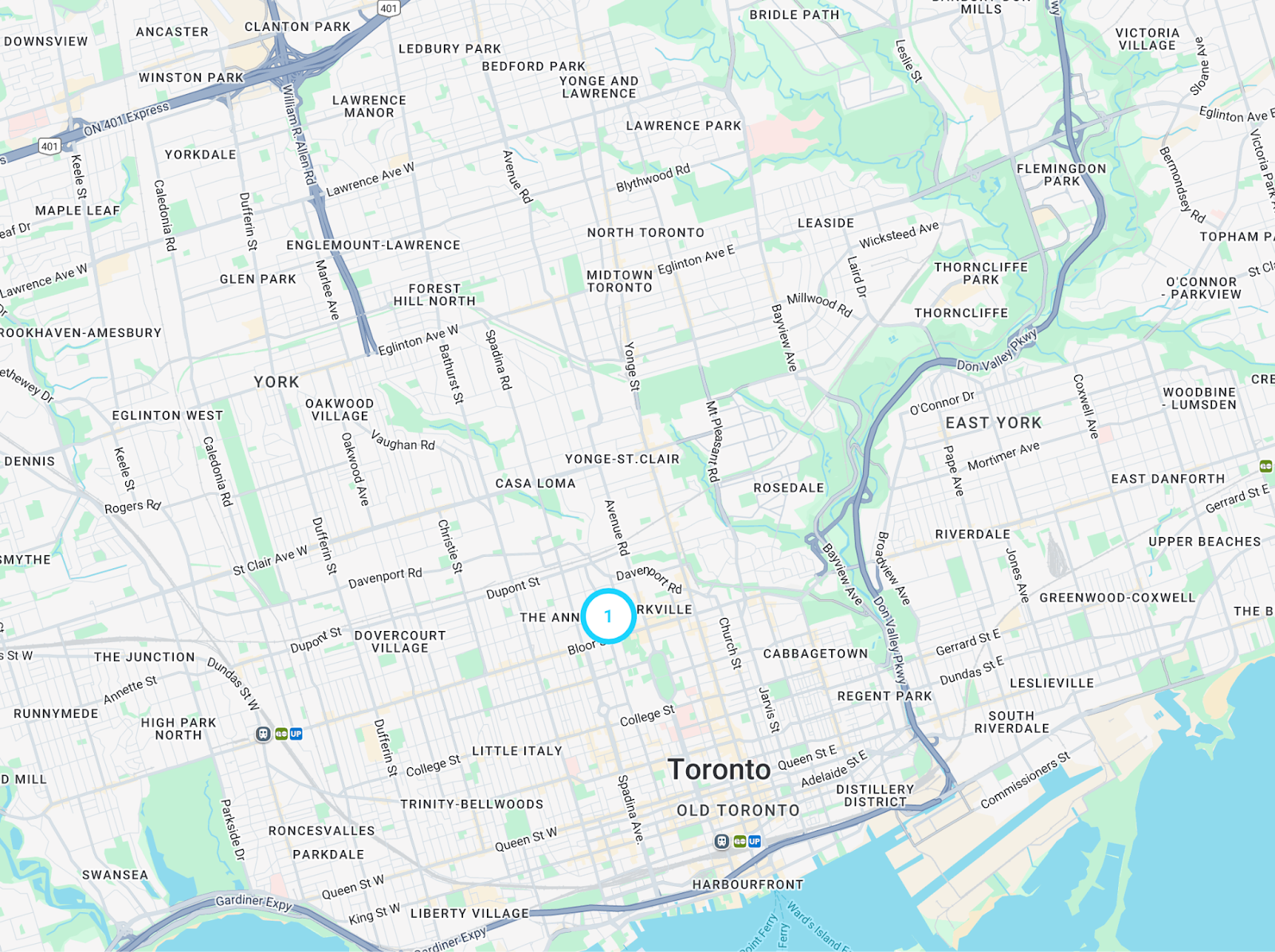
Toronto is obviously an Urban location, Yorkville, not far from the city core.
Let’s check for a rural station in the vicinity to compare.
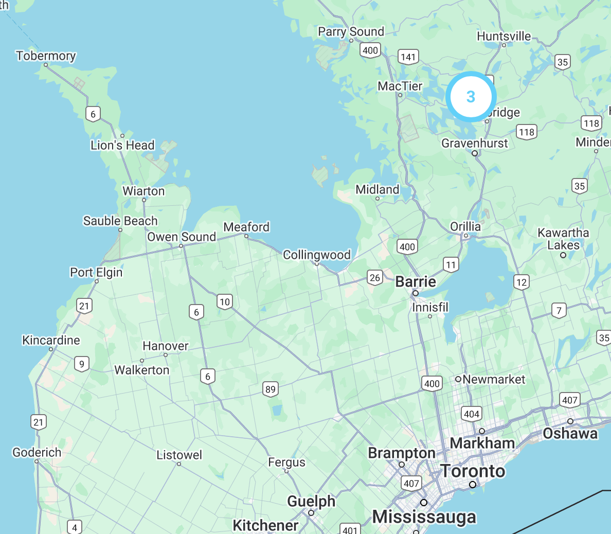
Beatrice, indicated by the number 3 on the map, is about 150 kms. North of Toronto and really can be described as “In the Middle of Nowhere” fortunately, with a very high quality thermometer record back to 1870’s
Beatrice:

This is a much different looking record from the Toronto record over the same time interval . While Tmax, for both locations, have very similar trends with Beatrice not surprisingly showing a lower absolute value due to its more northerly location. Tmin however is another story, Starting around 1920 the values for Toronto Tmin climbed higher while Beatrice Tmin Beatrice did not.
Toronto Squeeze:

Beatrice Squeeze:

Toronto/Beatrice Overlay:

Toronto/Beatrice Overlay Squeeze
No matter how we slice it the only significant CLIMATE anomaly is the temperature increase at the beginning of the 1900s.
This stark difference between the Toronto and the Beatrice locations raises the question of just how this apparent inconsistency would be dealt with when attempting to model past climate data.
This leaves the most important question: Are we measuring urbanization or are we measuring Climate?
This is a question that can be answered. There are enough quality records in SW Ontario and it is the topic of the next installment of “From The Desk of Shifty”.
Regional Overview:
Let’s look at a cross section of select locations across the country from west to east.
My apologies for the lack of clarity for this graphic. My intention here is to make the point that the thermometer data is surprisingly correlatable over very large differences(you might want to zoom in a bit). The temperature fluctuations that seem subtle and possibly caused by “noise” in the data are consistent and widespread. The data is consistent and reliable. The previously identified cold period pre-1900 is correlatable across the country and shows that the warming at the end of the 1800s is regional and likely even continental in scope.
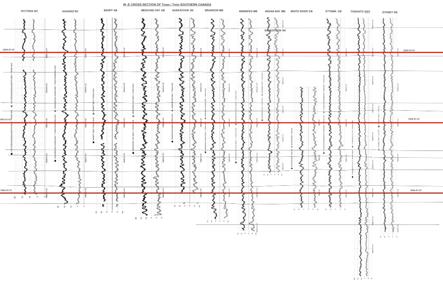
Let’s look at some of the locations in this x-section in detail.
Winnipeg Manitoba:

Brandon Manitoba:

Medicine Hat Alberta

OK! All I can say is “Where is the “Climate Change”?
Answer: 1900.
This is may be a good place to take a break. But stay tuned there’s lots more to come.
Before we end this segment however, let me leave you with this.
As usual we are being bombed by the media about some “cause du Jour”. This time one of the “very scary scenarios” is the connection between forest fires and “Global Warming”. This current round includes a focus on Banff Alberta and the risk of forest fires there. The National Post recently ran an article about this as it relates to the vulnerability of the entire Bow Valley. The article warns the dangers in the Bow Valley are very similar to what happened at Jasper last year. The article is very well written and the author seems to have asked and answered the question in a very well founded, data driven analysis until the “Global Warming Causes Everything” card is played and sure enough the elevated danger is, of course, due to Global Warming.
Here is the temperature record for Banff.
Banff Temperature Data:


Banff Detail:

This is starting to look like fraud to me.
Stay tuned. Much more to come.